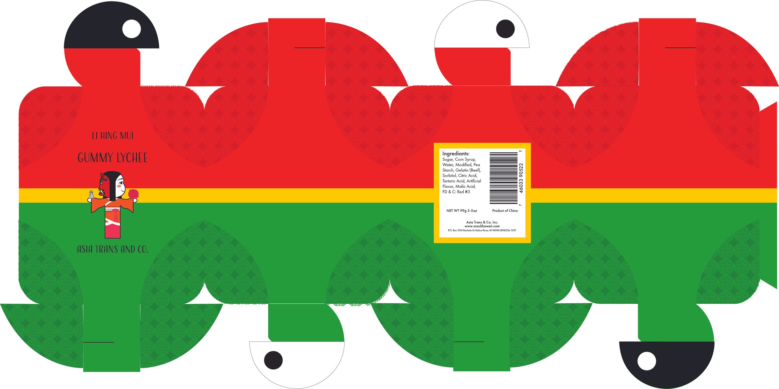
Gummy Lychee Packaging
This was a project in packaging class where we had to make a box with a unique shape. I had the choice to make up a product, but I found it more challenging to use it for an existing product. Li Hing Mui is a company that mass produces Asian sweets to Asian and Pacific Islander candy shops. Although the company did not sell their products in their own stores at the time, I tried to make the design based on if they opened their own shop.
Original Design
The original design was suitable for the mass production of the company. The colors and the mascot were the main inspiration for my design since I thought those were the best features. I wanted to remove the label aspect though because I felt it didn’t match with the rest of the packaging. Since we couldn’t use just any box, I chose this one because I really liked the idea of the “yin yang” element being on top and could envision a pattern on the flaps.
Mascot for brand
My inspiration was based on traditional Chinese elements and the colors of the lychee. She is holding a lychee on the “sweet” side and salt on the “red ogre” side. Although the model is wearing a Chinese outfit and the mask is more Japanese, the concept of the “red ogre” fits with the “salty and spicy” visual translation than a more traditional opera mask.
The final packaging combined had a more traditional Chinese design and focused on highlighting the mascot and the box itself. Further improvements I would make is to add a different design and color concept for the other locations they send their products to. The design is for physical locations so making things more regional exclusive excites general audiences, as seen with Starbucks and their exclusive regional products people collect.


